Graphic Design/ Brand Design/ Packaging
Skincare Line — The Brief
Design packaging for a nighttime skincare line. The line will have three products and each product will be different sizes and containers.
The Inspiration
For this skincare line, the names elicit superhero imagery— “Sleep Hero” “Night Hero” and “Dream Hero”. However, they are also nighttime products, which normally elicits a sense of calm and mutedness. I needed to find a way to balance the action names with a calming feeling for nighttime. For this I explored several ideas, from art pop and comics to the art in the 1990’s Sailor Moon TV show.
Goals
Create eye-catching packaging that elicits a sense of calmness while also supporting action names such as “Sleep Hero”. The packaging needs to stand out no matter the products next to it.
Packaging must be consistent across multiple products, however each product must be clearly distinguishable, so that there is no confusion between products.
Make sure all legal requirements are fulfilled while not disrupting the design. It is imperative to make sure that all necessary information about the product is on the packaging, and that it fits within the design of the rest of the packaging.
Ideation
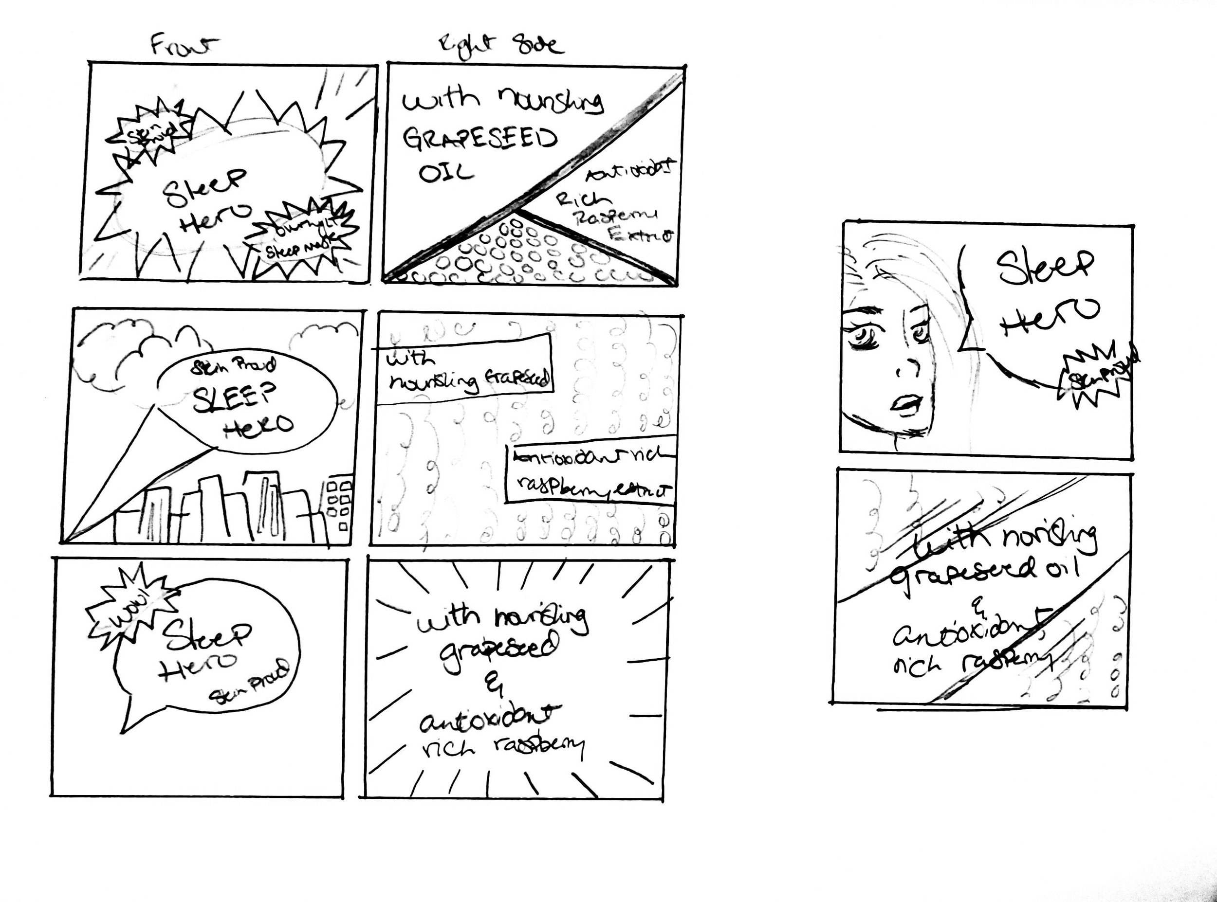
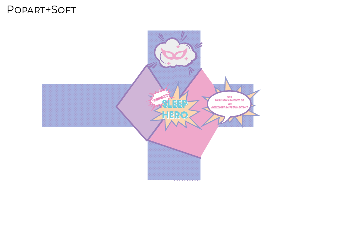
The first idea that I really thought I was going to go with was a Pop Art/ Comic book feel. I loved the half-tone patterns and thought the colors would be a blast to work with. However, it’s bad practice to only ever have one initial idea, so I also thought of going with a soft, more pastel look, with dreamy bubbles and moons.


I began working on my die-line, and fleshing out each idea. I tried Pop Art, the softer look, and Pop Art, but with a pastel palette, and explored typefaces.


Imagery
Going in the opposite direction than what I initially thought I would, I decided going with the soft, pastel, dreamy look would work best. Pop Art was just too bright and vibrant to give off the calmer feeling that needed to be portrayed.

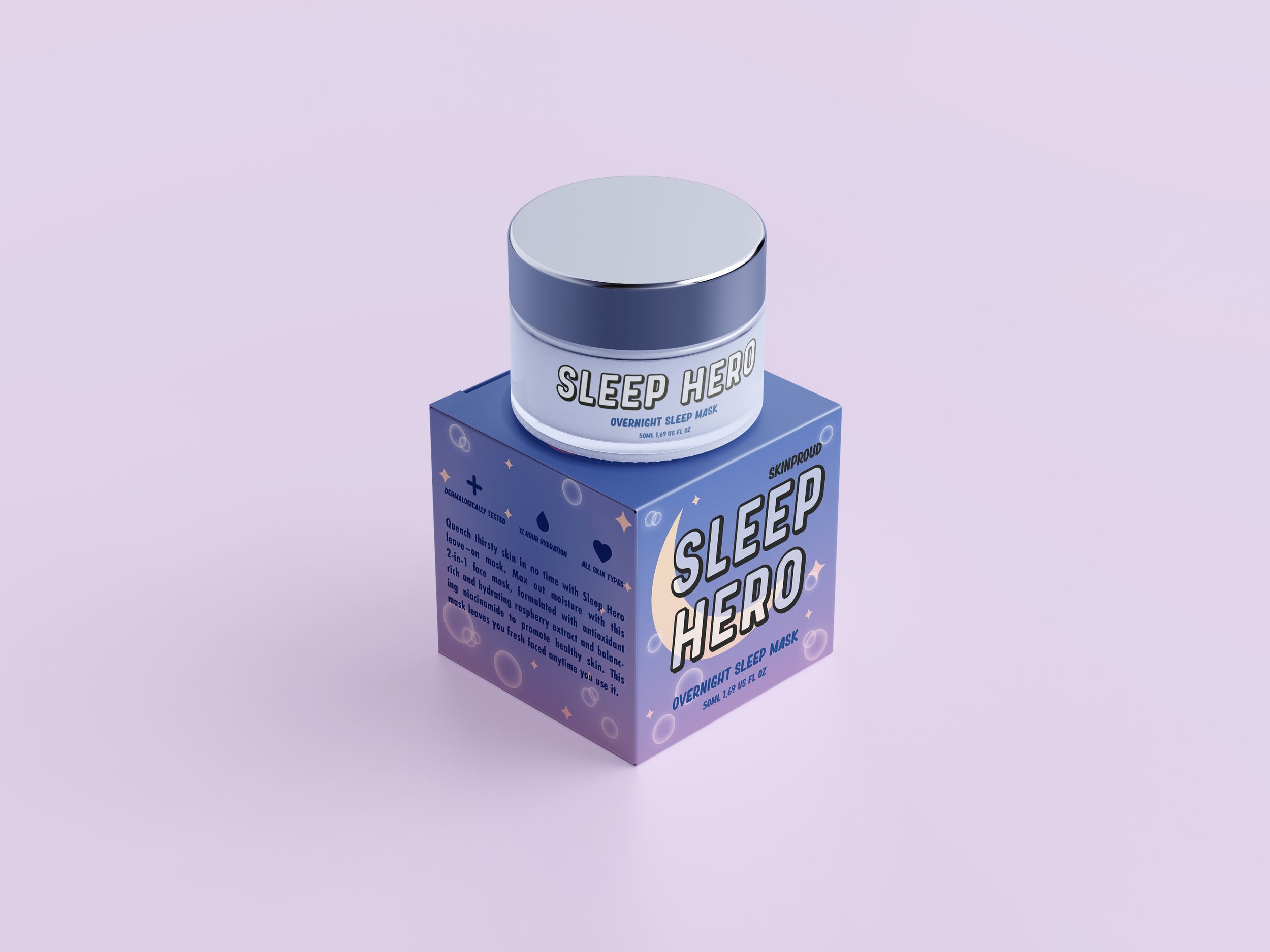
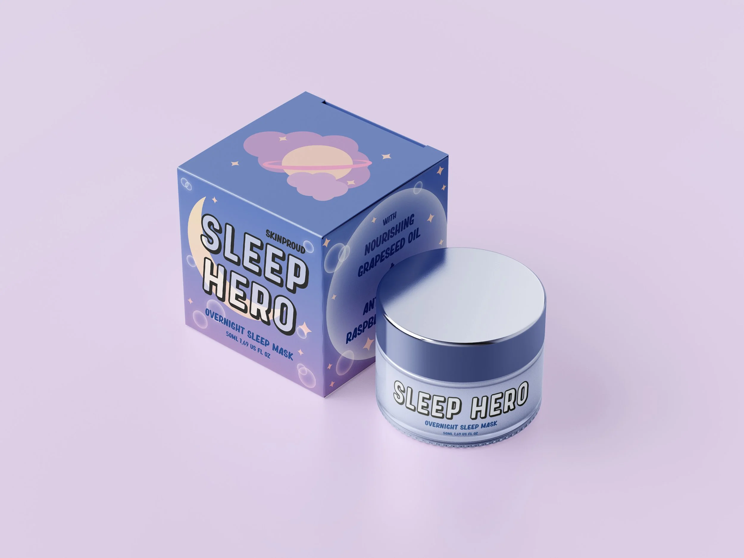
Soft pastel colors, little stars with rounded edges, and bubbles create a soft and dreamy look. Subtle pink gradients helped add a “hazy” quality that adds to the softness of the overall design, as well as created additional contrast for text to sit against without getting too entangled into the background. I kept the imagery simple, with as few lines as possible to help keep things simple so that a consumer doesn’t get overwhelmed by the packaging. Simple lines and a soft palette help make this easy on the eyes.
Typography
For the product name, I decided to use Prequel Demo. It is round, friendly, and bold.
Final Solutions
The final solution consists of a face mask, a facial cleanser, and a skin serum. I have mockups for each, as well as the flat files included.
Final Reflection
Creating such a soft, dreamy look was so much fun. I loved adding in the bubbles, stars, and clouds to create such a cute little night sky on the boxes. The end result ended up being very cute and soft, however, still bold enough to stand out on a shelf with other products. This project is currently finished, but if I had more time adding in another product or two would be fun.


