
UXUI/ Visual Design/ App Design
Clover — The Brief
To create an app that will help users with thorough and comprehensive self-care. The app will not only facilitate self-care, but will also help users learn more about caring for themselves, dive deeper into what methods work best for them, and plan and track their self-care progress.
The Inspiration
My inspiration for this app stems from my own frustrations. There have been several times I decided it was time to take care of myself better, and as the saying goes “there’s an app for that”. I had tried to use some recommended apps but I often got frustrated with paywalls or needing to have 5 different apps to have all of the features I wanted, only using one or two from each. When it came time to decide what to do with the prompt “self–care app” I decided I wanted to cover that topic as widely and encompassing as possible.
Goals
Create an app that is comprehensive in allowing users to better care for themselves, both from features within the app and facilitating real-world activities.
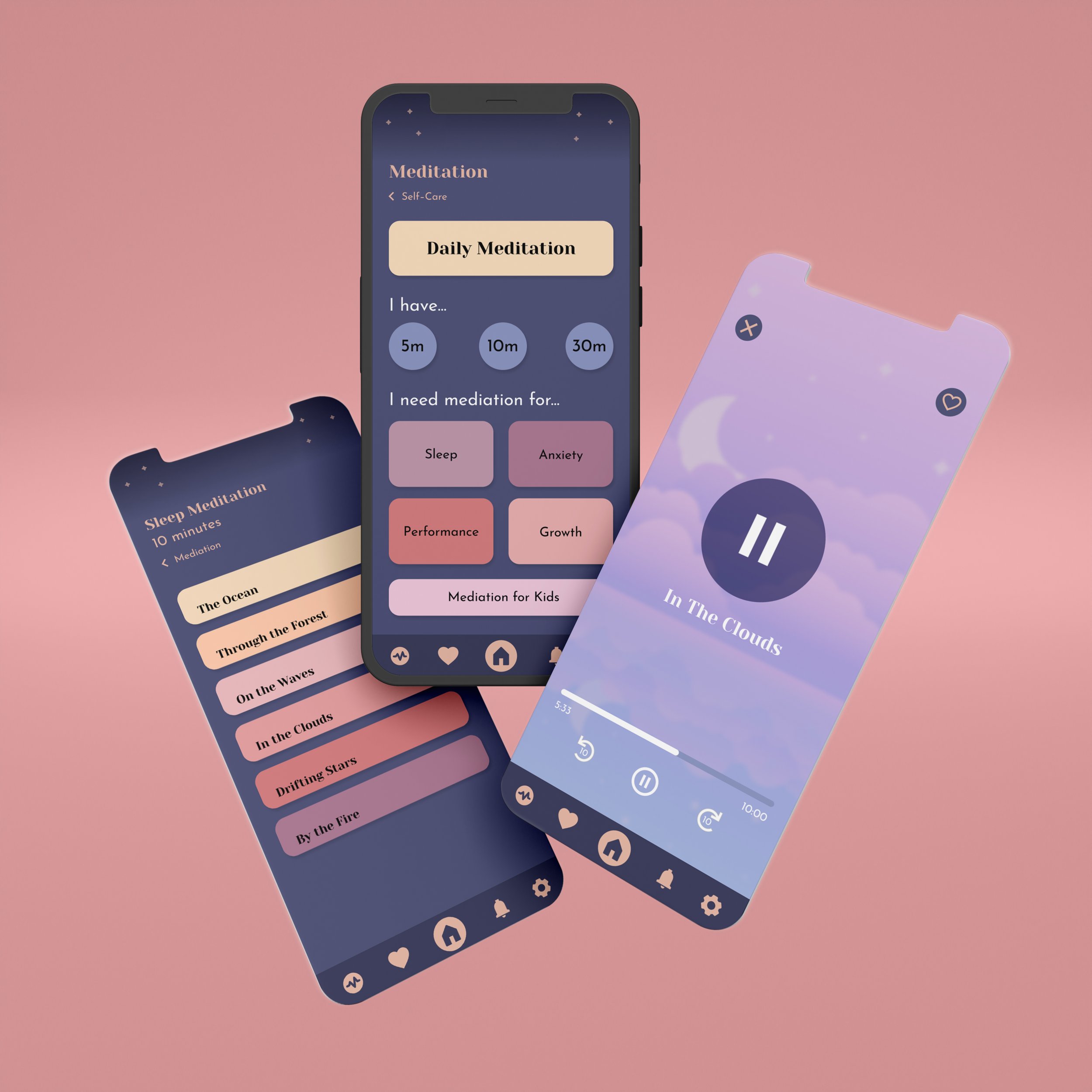
Create a sense of calm within the app, using color schemes, graphics, typography, and text. Avoiding a sense of pressure or urgency to help the user feel relaxed while using the app.
Build for a wide variety of users. This includes not only keeping accessibility in mind, but inclusivity in gender, age, and in activities provided, as what works for one person will not work for another.
Research
I had minimal experience with self-care apps, so research was of the upmost importance. I had to discover not only the finer details of what self–care is, but how others view self–care, and what tends to stop people from practicing self–care.
I conducted interviews asking people of all genders, ranging in ages from 21 to 35 a set of questions:
1. What does self–care mean to you?
2. What do you do for self–care?
3. What features do you expect to be in a self–care app?
4. What features would you add to a self–care app?
5. What is annoying or difficult about existing self–care apps?
Based on interviews, science-based articles, and existing apps, I created webs, lists of potential features, and a conceptual model.

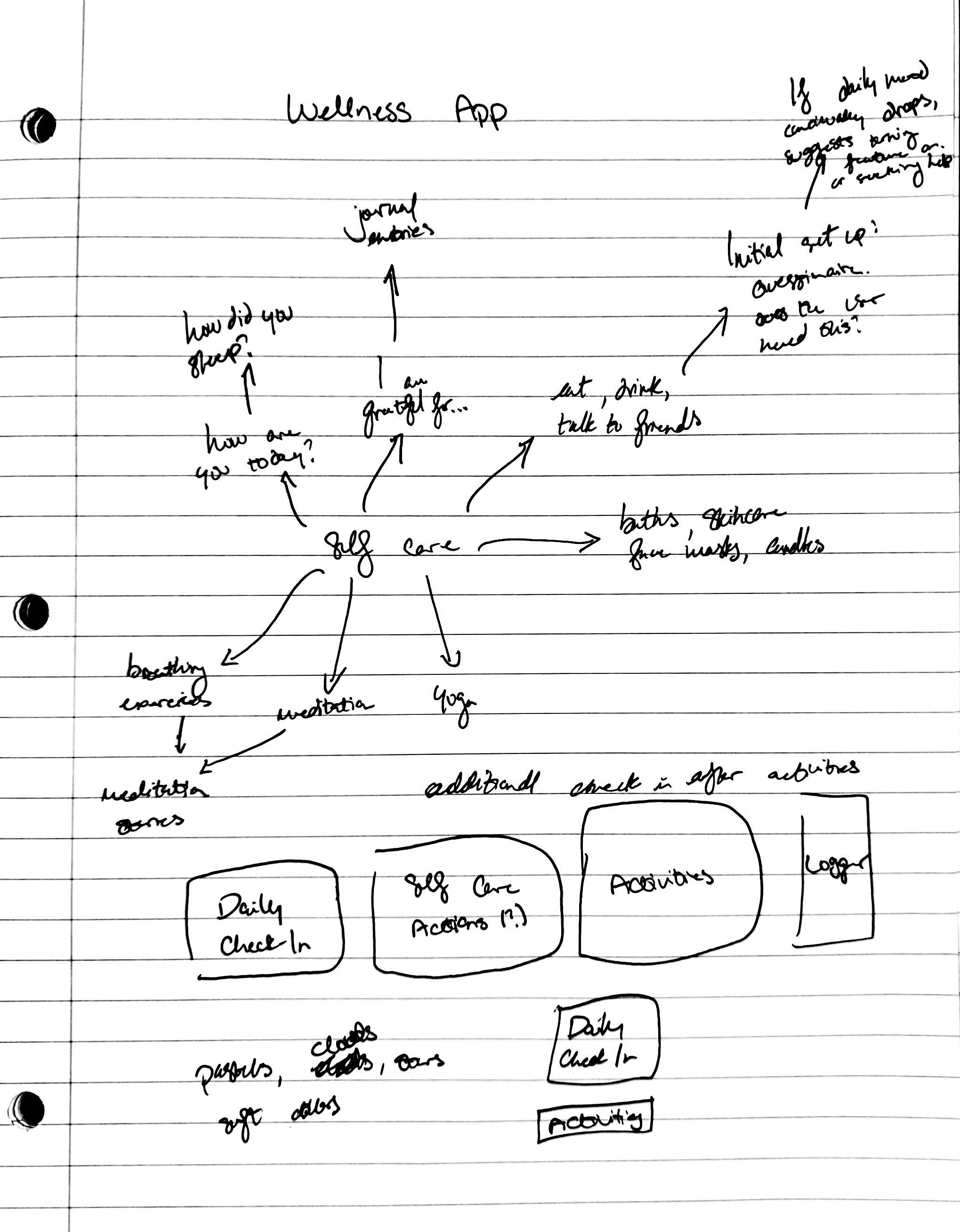

Wireframes
After building my conceptual model and having an idea of what features should be in the app, I dove into wireframing. At this point I hadn’t been completely convinced I wanted to include all of the features I had listed, however, I decided that I really wanted to be as inclusive with this project as I could, and to flesh out as much as I could.
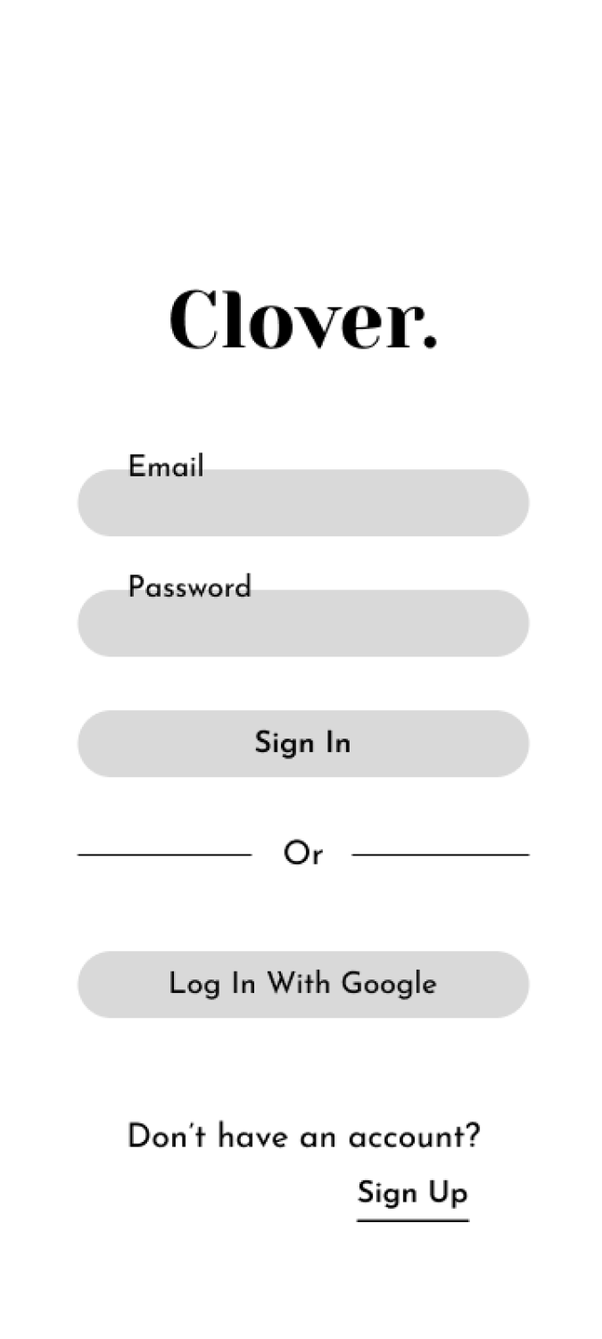


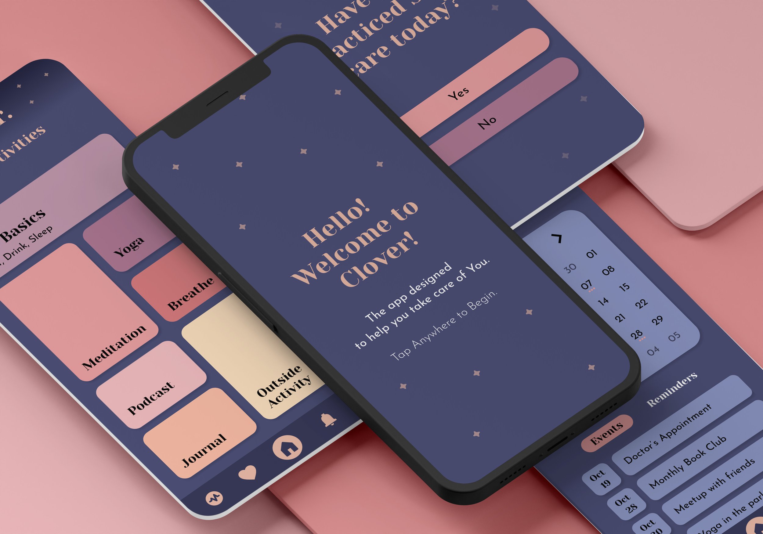
Next was deciding color palettes and visuals. As this app focuses on slowing down, taking care of oneself, and having an overall calming vibe, I focused on softer shapes and more muted colors.


I decided to use Yeseva One for headings and labels, and Josefin Sans for body copy.
Final Solution
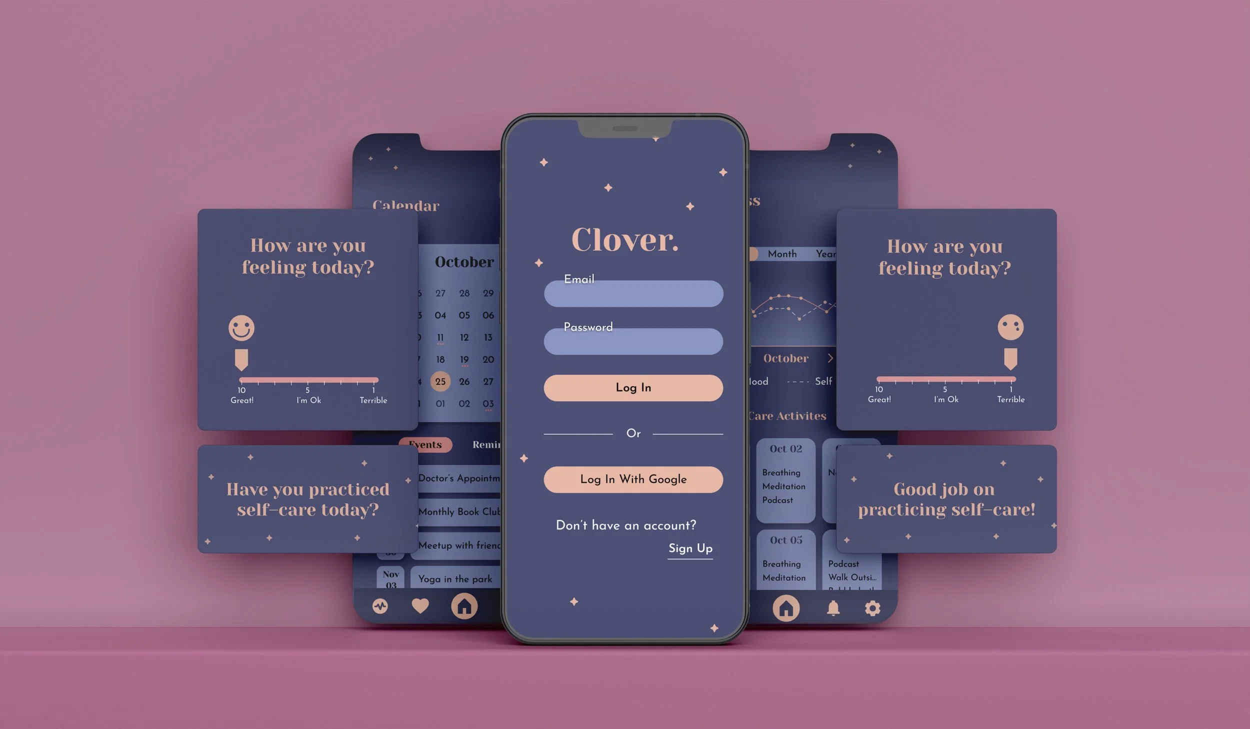
The end result is an app that covers a wide variety of needs: the user can keep track of food, water, and sleep, set reminders for self–care, listen to podcasts, complete yoga exercises, practice meditation, journal, utilize breathing exercises, facilitate outside activities, keep track of their daily moods, and see their overall progress. The interface is easy to navigate and is overall calming.
Interactive Prototype



Final Reflection
This is a project I’m really proud of. I decided to go beyond the original bounds of the project and flesh out as much of the app as possible. It was a lot of fun, and I learned so much about taking *how* people think into consideration. My designs often tend to be really bright and bold, and this was also an exercise in designing something a little more soft and soothing.


