
UXUI/ Visual Design/ Brand Design/ Teamwork
Mission Accomplished — The Brief
In a team setting, restructure the information architecture, revamp the existing branding and create a style guide, then redesign the website to streamline usability.

The Client
Mission Accomplished is a nonprofit organization that runs a mobile laundry service, has clothing donations, as well as yearly events and giveaways to aid those experiencing homelessness.
The Problems
The client had quite a few issues with the website.
Information architecture issues
Confusing navigation with multiple unnecessary levels
Broken links throughout the website
A later audit showed only two links worked in the entire site.
General lack of information
Finding out the purpose of the organization was difficult
The information found didn’t answer many questions for the user
Spread out across multiple websites
The client was using two additional sites to get things done.
Goals
Completely restructure the information architecture. Build a new sitemap from the ground up.
Update the brand identity to better match the goals of Mission Accomplished and create a style guide for use on future branding.
Redesign and streamline the website for usability, clarifying information, and encouraging users to volunteer.
Project Plan
The project would take place over 11 weeks and have three main stages:
Stage 1
Information Architecture
Conducting site audit, creating sitemap, and tree testing
Stage 2
Brand Design
Moodboards and Style Guide
Stage 3
Website Redesign
Sketches, wireframes, high fidelity mockups, prototyping, user testing
Information Architecture
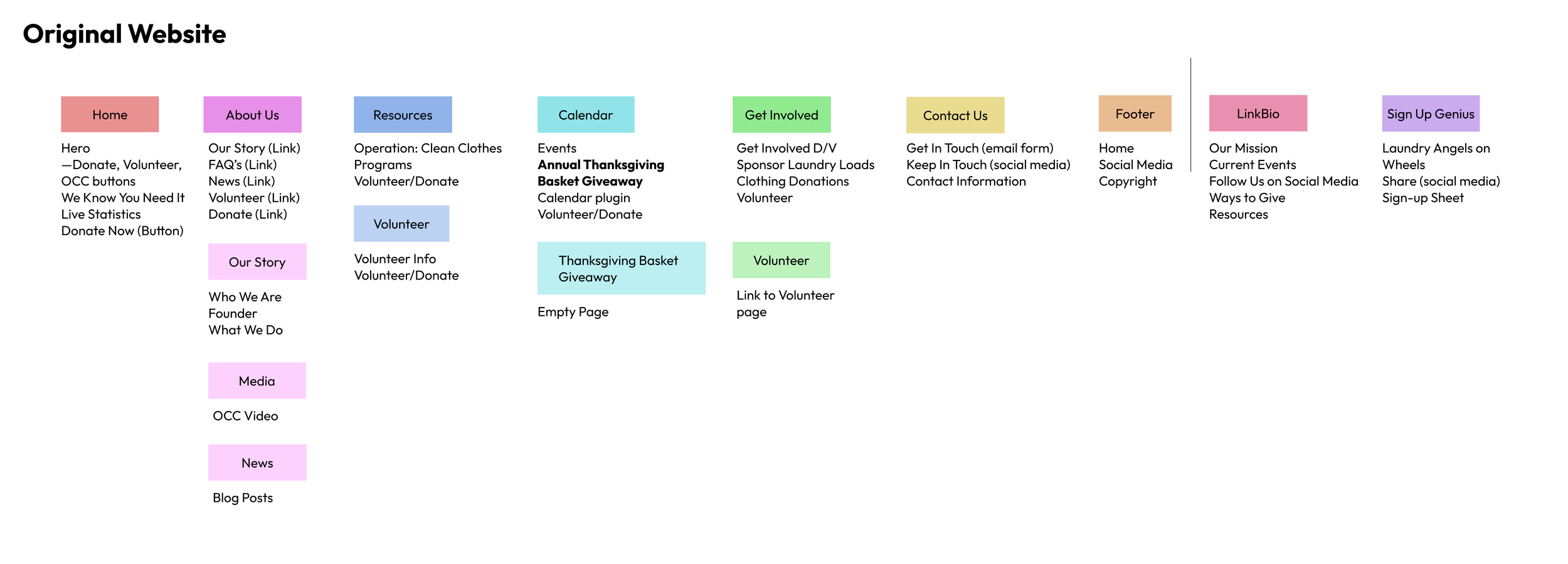
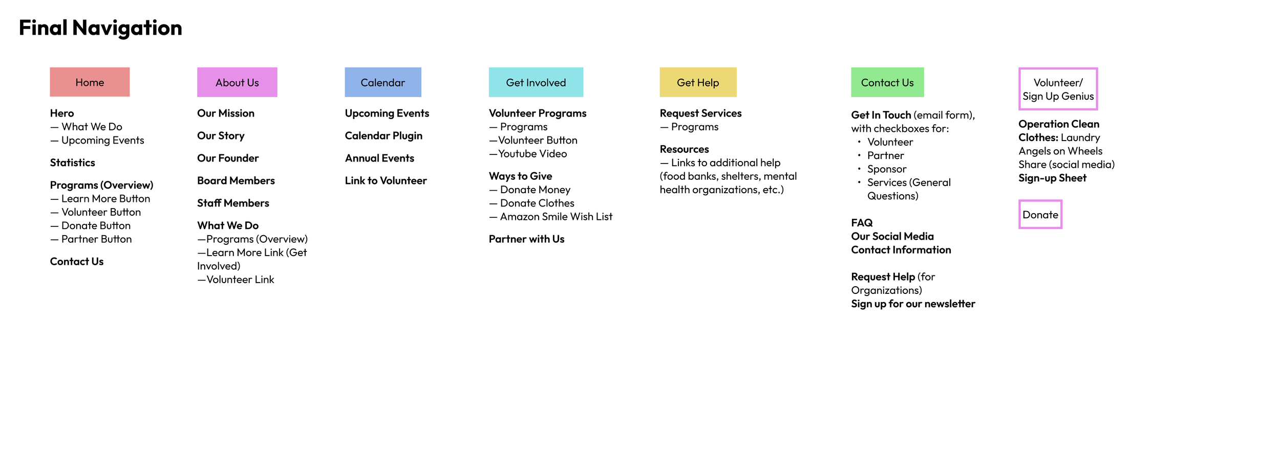
For this portion of the project, my teammates and I each made a potential version of the new navigation. Then, we went over each of our navigations, discussed, and combined them until we had something that was much better organized and easier to navigate. We also conducted a tree test to make sure that our new sitemap was working and used it to refine any issues. Below are the original and final sitemaps.
Moodboards
While the beginning portion of the project was extremely collaborative, for the design portion we had a divide-and-conquer attitude. We divided up who would be in charge of what pages for the style guide and website, and each created our own moodboard for future design direction. My moodboard was the one eventually chosen by the client.
For my moodboard, I incorporated a revamped color palette, updated typography, and used dynamic shapes with overlapping photography and illustrative elements. The dynamic designs and bright colors are to help encourage people to volunteer and to truly hold up to the inspiration of the name “Mission Accomplished”

Sketches
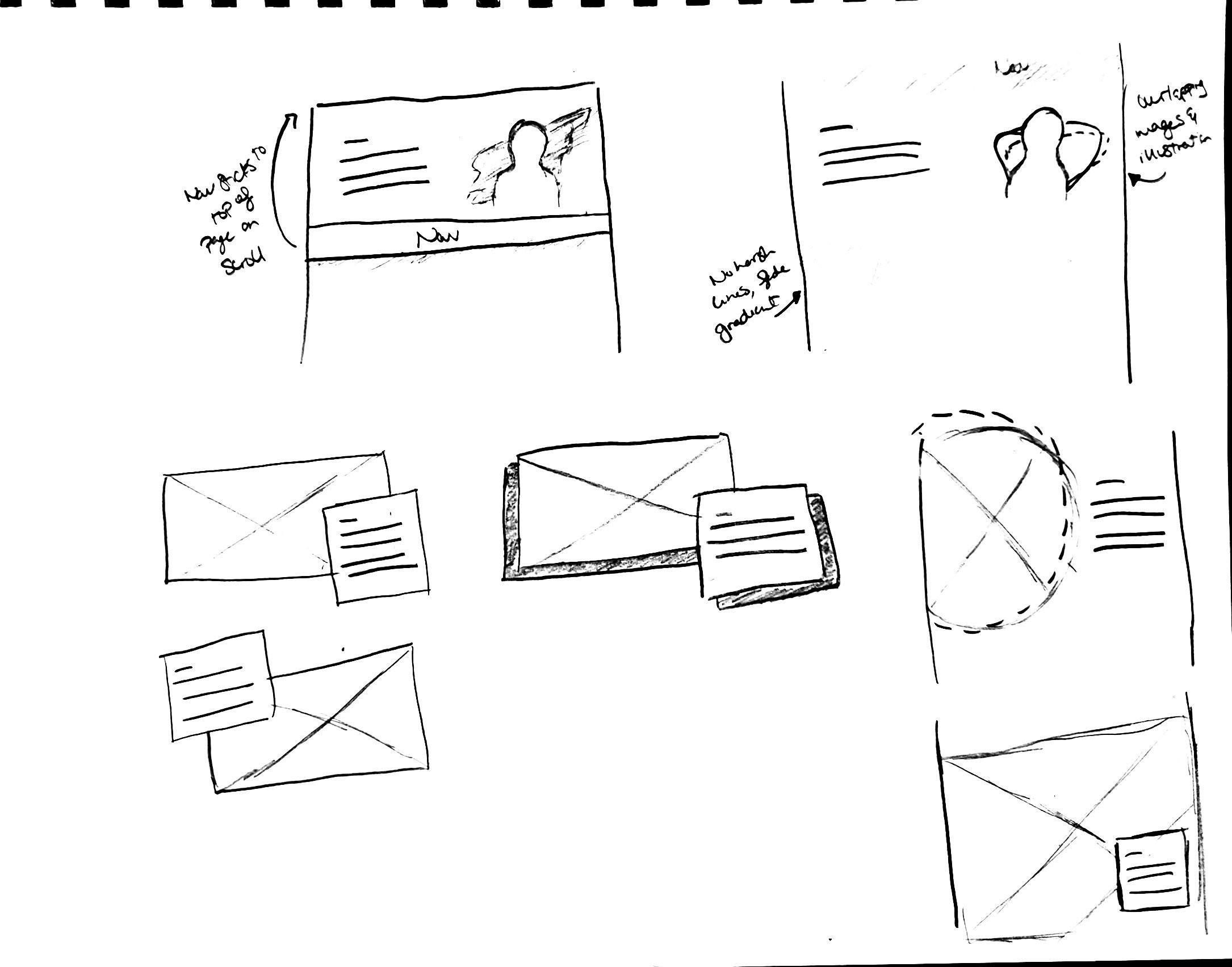
Next up was time for sketching. Although I technically only needed to sketch the pages I would be designing, I wanted to do more ideation and sketch the entire website, plus some components.



Wireframes
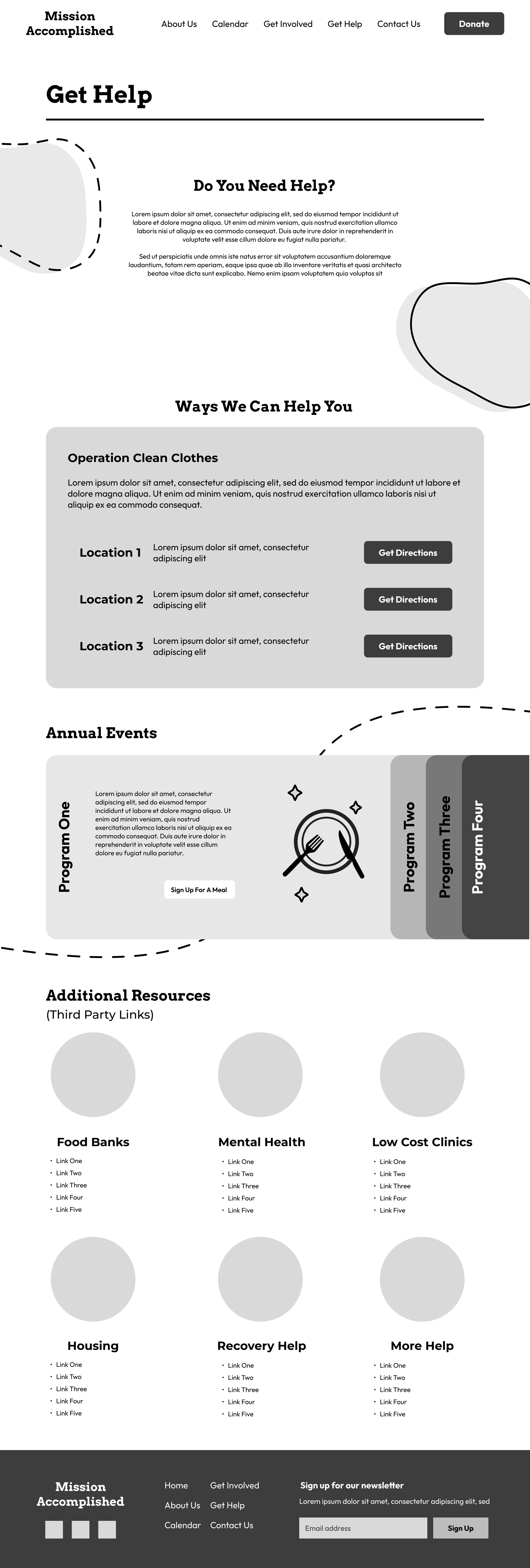
Although each team member was only going to design two pages of style guide and website, each of us sketched and wireframed the entire site and then Frankensteined our wireframes together into a final mid-fidelity wireframe that was brought into high-fidelity mockups. Below are my personal wireframes.


Final wireframes made by combining all of our wireframes.



Design Direction
Below is the finalized design direction for Mission Accomplished, including colors, shapes, and typography.


For typography, we used Arvo for main headings, Monserrat for alternate headings, and Outfit for subheadings and body copy.
Style Guide
Now that we had our design direction and wireframes, we moved on to the style guide and final high-fidelity mockups. Because of time constraints, we ended up needing to work on the style guide concurrently with the final mockups. I did the About/Personality Pages, Logo & Usage page, reconstructed the logo from scratch, and helped with the images/illustrations page, and all of the team members worked together on the components page. Below is an interactive prototype of our style guide
Interactive Prototype
The prototype is scrollable. To navigate to the next page, click anywhere within the screen.
Website Redesign
For mockups I was in charge of the homepage, Get Help page, and did a recolor for the Sign Up Genuis so it could match new branding. I found and edited all of the illustrations, found a lot of the stock photography, and did the research to find all of the resources for the Get Help page.
It ended up being such a tight timeline for everything, and even for as much as I did individually, it was still such a team effort getting everything done. We held a lot of extra meetings that would go on for hours as we designed together, gave each other feedback, and really worked to create the best website we could.
Interactive Prototype
Final Solution
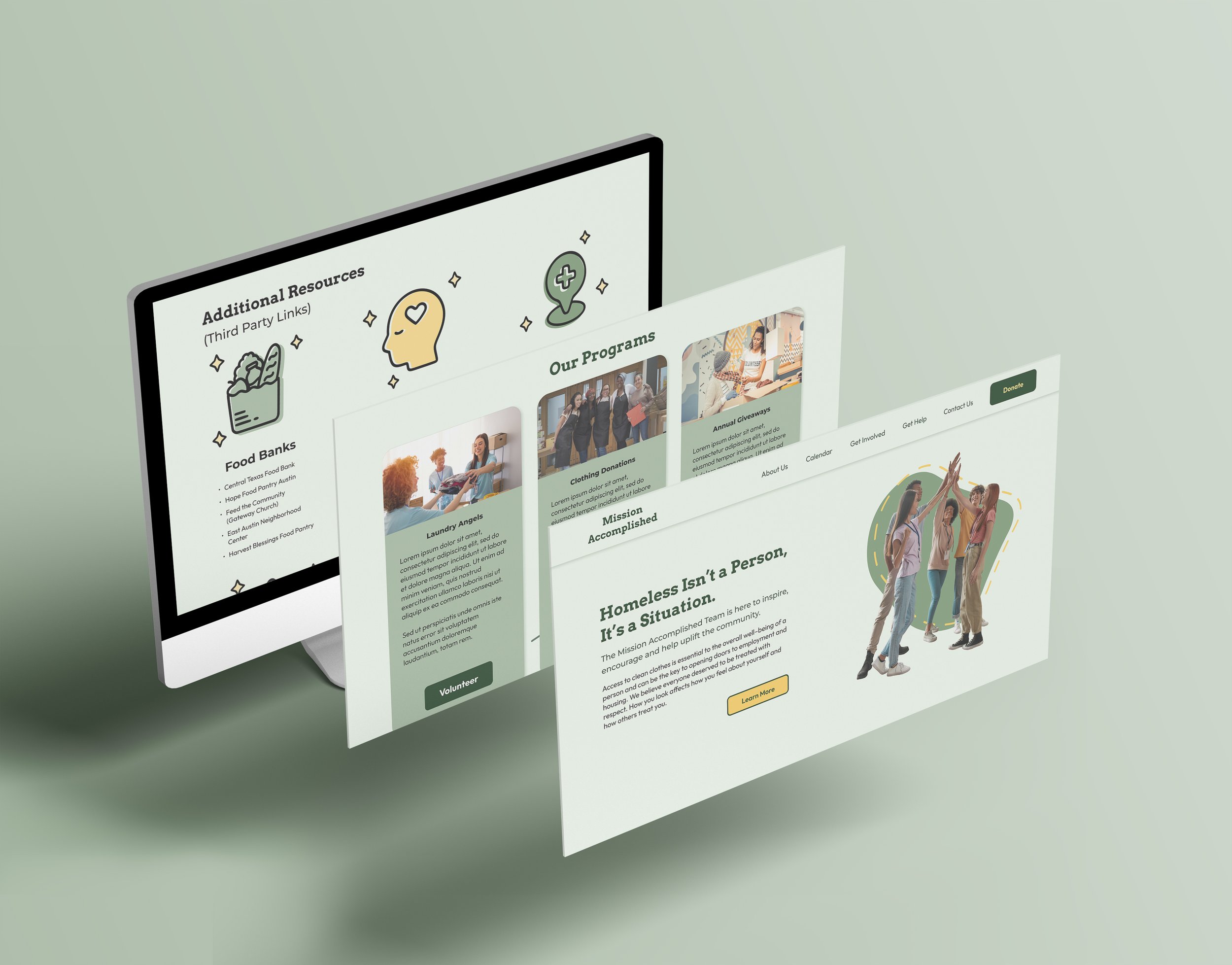
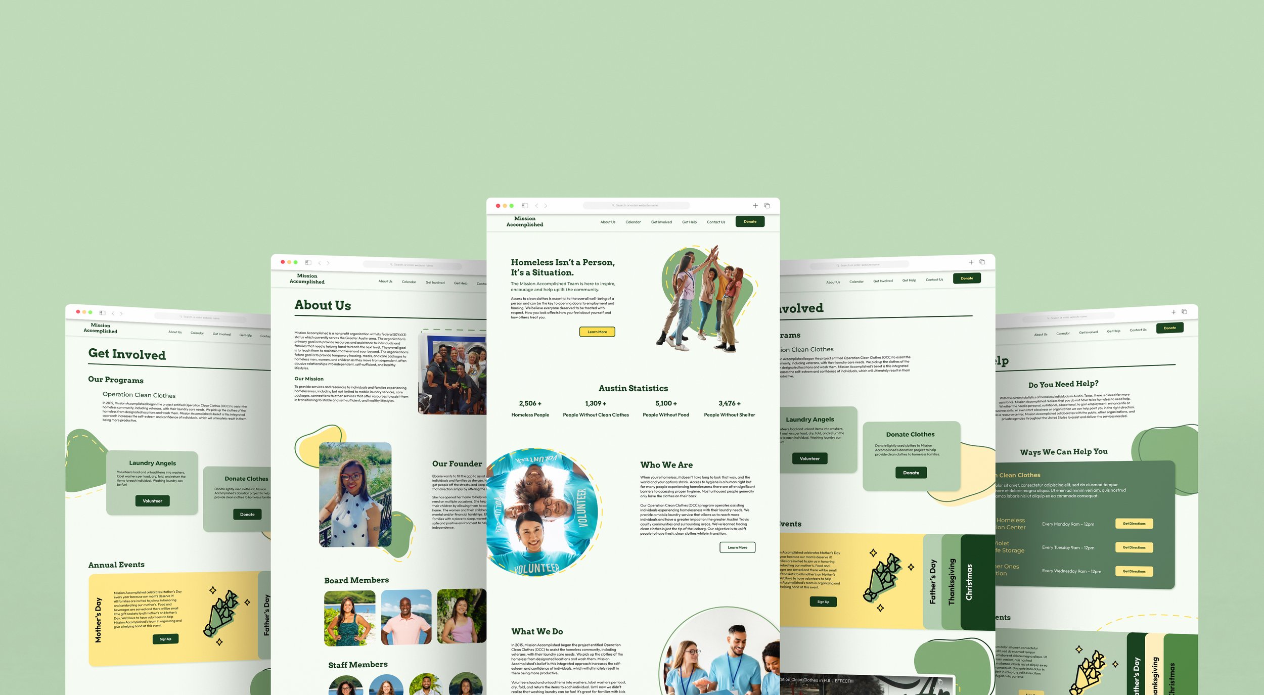
The end result is a completely revamped website and branding solution for Mission Accomplished. The website is information architecturally sound and is streamlined for usability. The client now also has brand guidelines that can be used not only to potentially expand the website but can also be applied in other media applications, such as print brochures or social media posts.



Final Reflection
Working in a group was a really amazing experience, and I was really lucky to have an amazing team. We all got along well, and they’re great designers.
Service learning really helped put so much into perspective for me, even in how I worded things. I’m just really honored to be able to help those who are out there helping others and hopefully make their job easier for them.
Note: At the personal request of the other team members, I have not added their names or LinkedIn profiles. If you have any questions or would like to contact them, please let me know so that I can reach out to them. Thank you.

