Visual Design/ Web Design/ Marketing
This project was featured as part of an exhibit in Austin Studio Tours 2022.
roby. — The Brief
Design a website to market an email assistant. The assistant will help users keep their emails organized and help take care of tasks. Design to inspire emotion.
The Inspiration
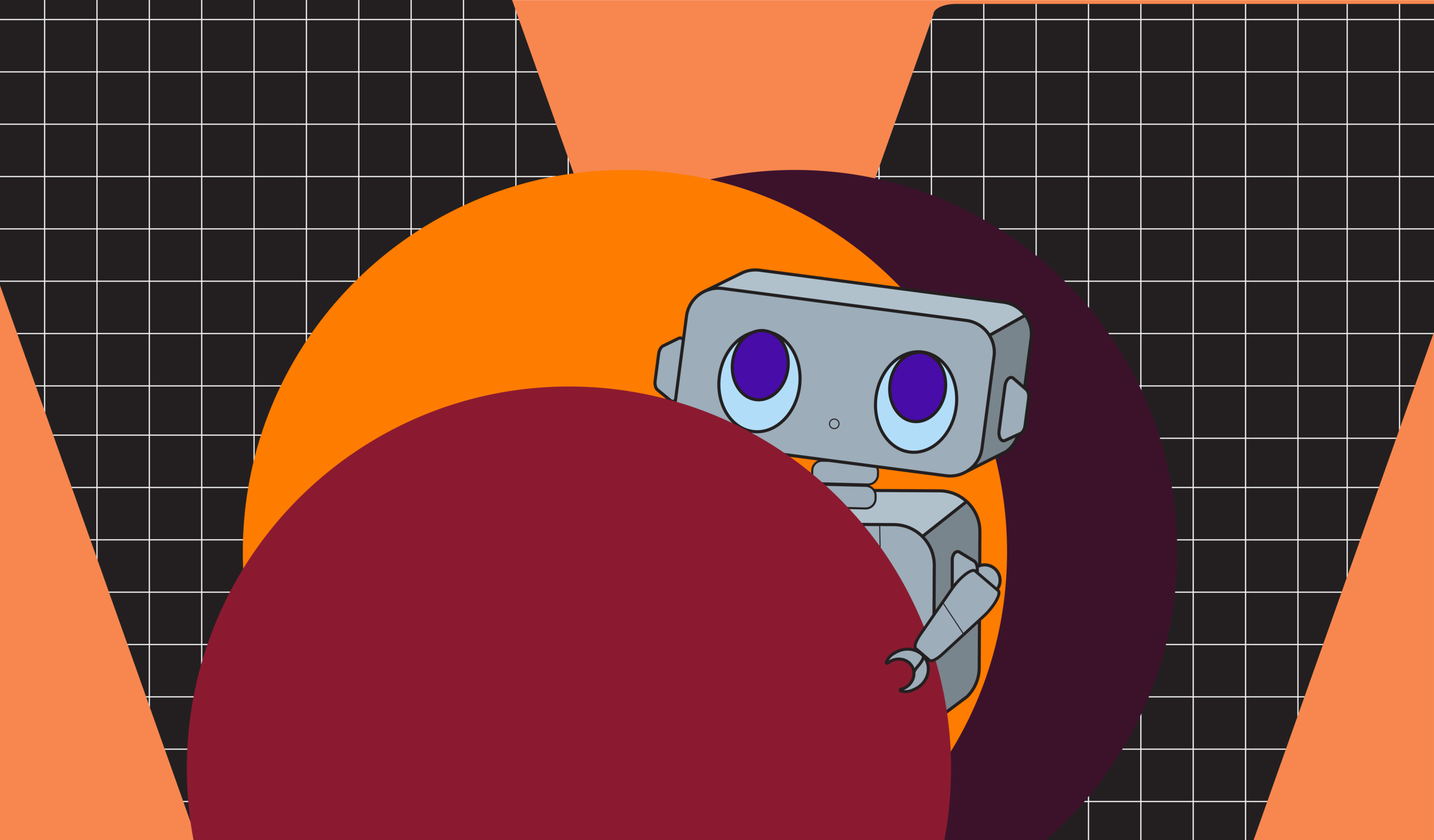
When recieving this project, I realized that an excellent way to market the email assistant would be to create a character or mascot that would personify the assistant. By personifying the assistant— going so far as to include the character into the user interface— the assistant is no longer just a faceless program, but an actual assistant who just wants to help out the user. This will help inspire confidence, a sense of security, and build an affinity for the character.
Goals
Design a website that clearly explains everything the assistant can do. Users need to know what the assistant can do and why it will be an awesome tool to help them keep their email in order.
Create a sense of affinity and security with the assistant. The user needs to know that their information is safe, and that all the assistant will do will be to help them with their email.
Make the design stand out. There are similar tools out there, and sites that sell similar products. The user should be excited about this product and see why they need to get this assistant over others on the market.
Ideation
I decided to make the character into a robot because they are so often seen as helpers. I took inspiration from Clippy, Wall-E, and the 1986 movie Short Circuit. These helped me springboard my ideas of how I could expand on that and create a character to embody this assistant. As is often the case in Hollywood movies though, as helpful as robots can be, robots can also be seen a little antagonistically. To mitigate this and instill a sense of harmlessness, I decided that the robot would need to be absolutely adorable. Cuteness will also increase a sense of affection, so it worked on several levels.


Building roby.


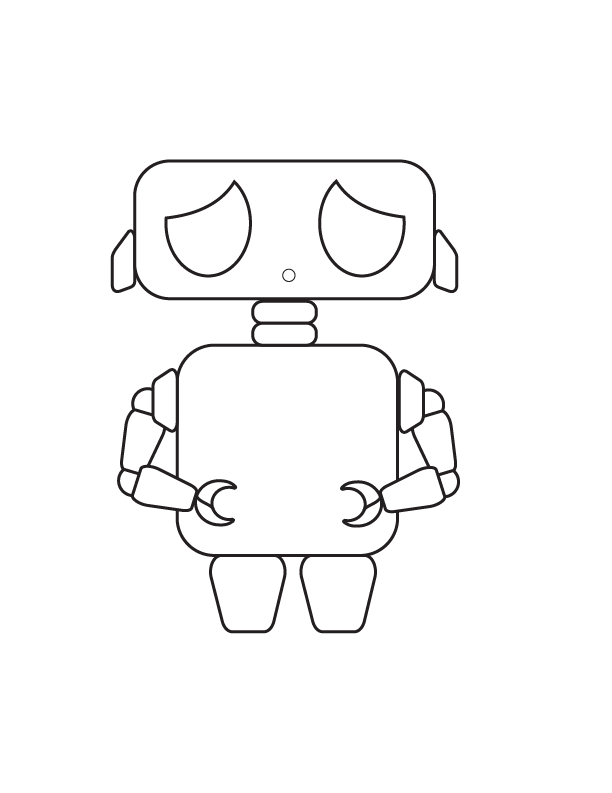
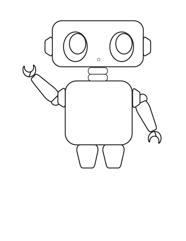
The first renditions of Roby were pretty rough, and he ended up looking more like he was ready to take over the world than help sort your email. A little too doomsday-destruction chic than what was intended.
Reworking the digitized sketches and the coloring worked wonders on making Roby cute rather than ready for destruction.


The final version of Roby.


Building the Website
Now that I had Roby, I began building the website. I had a couple of ideas I tried really hard to make work, but there came a certain point I realized they just weren’t going to gel. However, an offhand comment was made about an element in one of my designs being reminiscent of VCR covers, and I decided to really lean into the idea. As cute as Roby is, I wanted to cement in the feelings of safety and trust. By going with an 80’s vibe, it calls back to nostalgia and to what is often considered a very safe time.


Final Solutions
The final solution includes a scrollable prototype to interact with, as well as several mockups to show the website in use.
Final Reflection
I thoroughly enjoyed creating Roby and thinking of new ways to incorporate 80’s VCR cover designs into the web layout. Creating a look that was both modern and retro was really fun. While the project is currently complete, in the future it would be fun to create an entire user interface for Roby.


